COOPER’S BOTTLESHOP
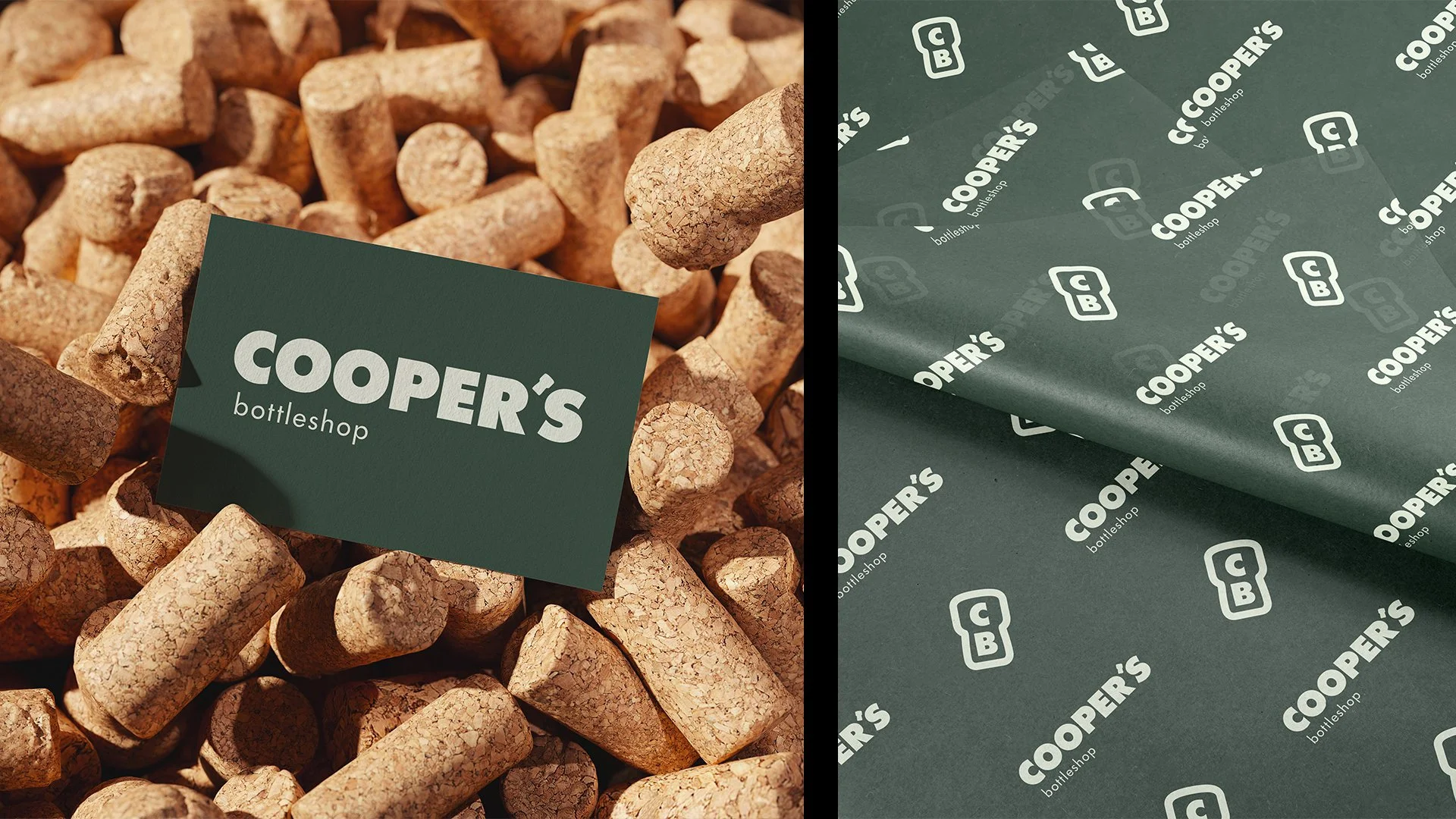
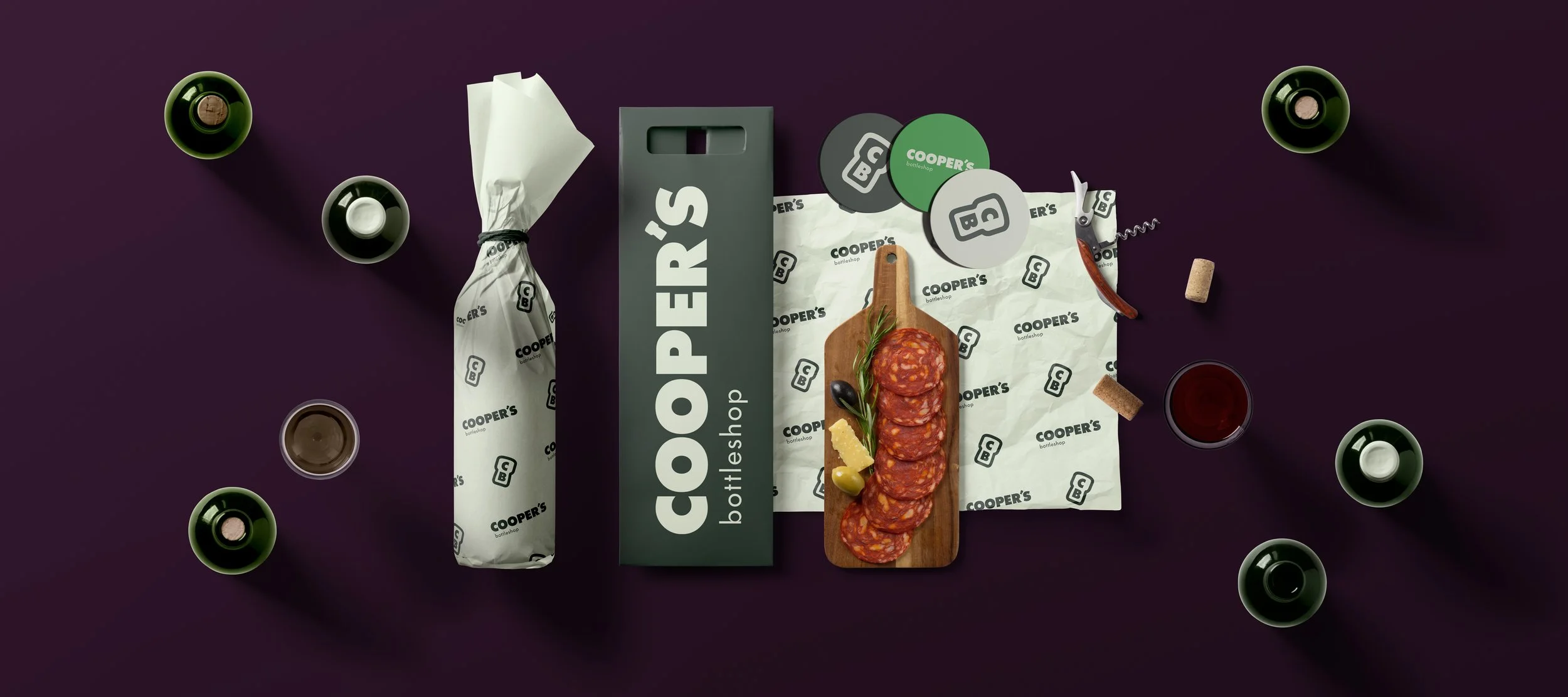
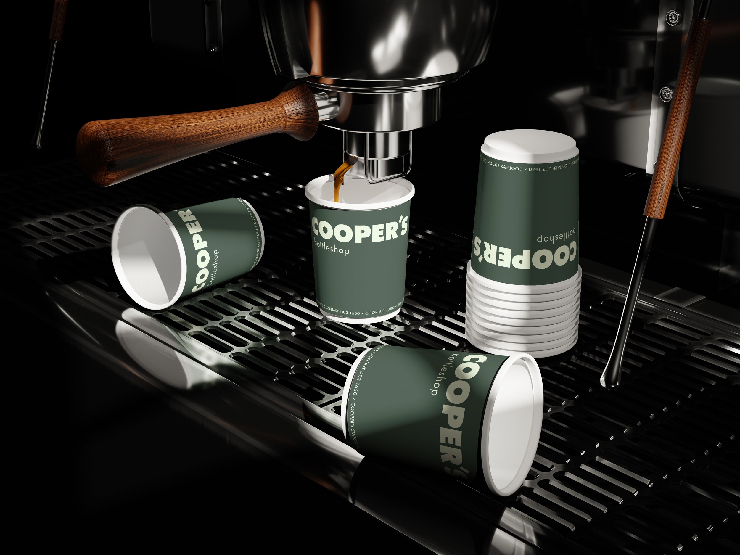
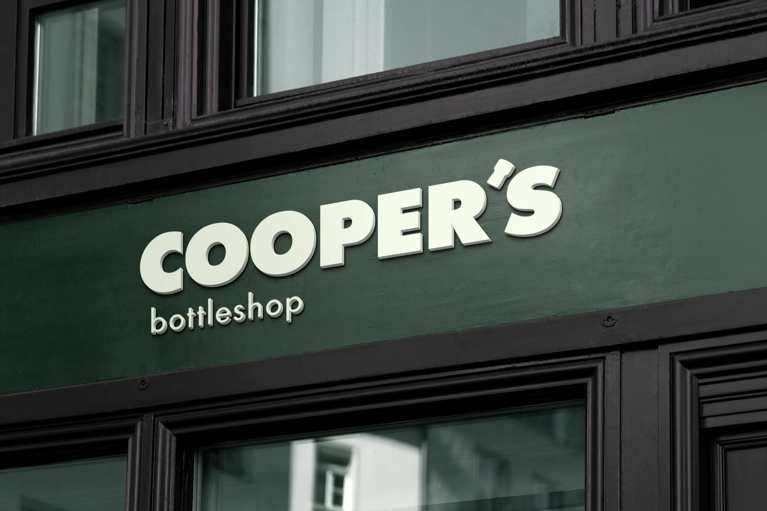
Our studio was commissioned to refresh and refine the brand identity for Cooper’s Bottleshop (a wine bar, bottleshop and coffee stop with locations in Sutton and Clontarf), with the goal of evolving their established branding into something more distinctive, scalable, and memorable - all the while maintaining the clean, straightforward character at the core of the brand. The brief called for subtle yet meaningful typographic customisations, exploring hierarchy, readability, and personality across both “Cooper’s” and “Bottleshop”. Central to this exploration was the creation of a custom apostrophe mark inspired by a popping bottle cork, offering a playful, ownable nod to the shop’s product offering.
To align the visual identity with the newly painted storefront in Clontarf, we updated the colour palette to feature Colourtrend’s “Christmas Wreath” as the primary brand shade, supported by a fresh off-white and a vibrant lime green to introduce brightness and flexibility. The final logotype balanced clarity with character, incorporating the bespoke cork apostrophe and refined type treatments for improved cohesion. From this, we also developed a monogram logomark using the cork icon as a standalone brand asset, giving Cooper’s Bottleshop a versatile visual system that honours its heritage while elevating it for the future.